 Ja'Mesha Robinson
ServiceConnected.vet
Veterans say it their way. An AI symptom translator shows how the VA needs to hear it.
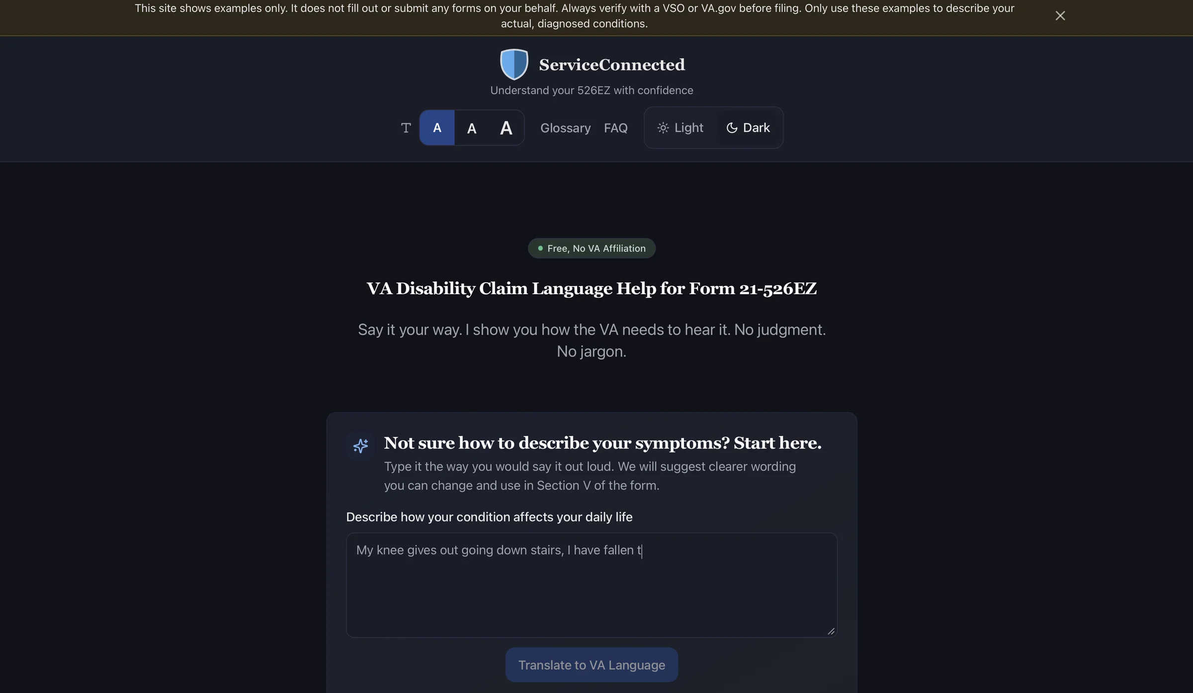
The problem
The 21-526EZ asks veterans to explain how service affected their health, in language the VA recognizes. Most veterans face that blank box alone.
I built it as a veteran, for veterans: a free guide that is plain about what the VA needs and leaves the writing in their hands.
Four design decisions
Four intentional design decisions shaped the experience: building trust, making complex information understandable, reducing overwhelm, and helping veterans make informed decisions.
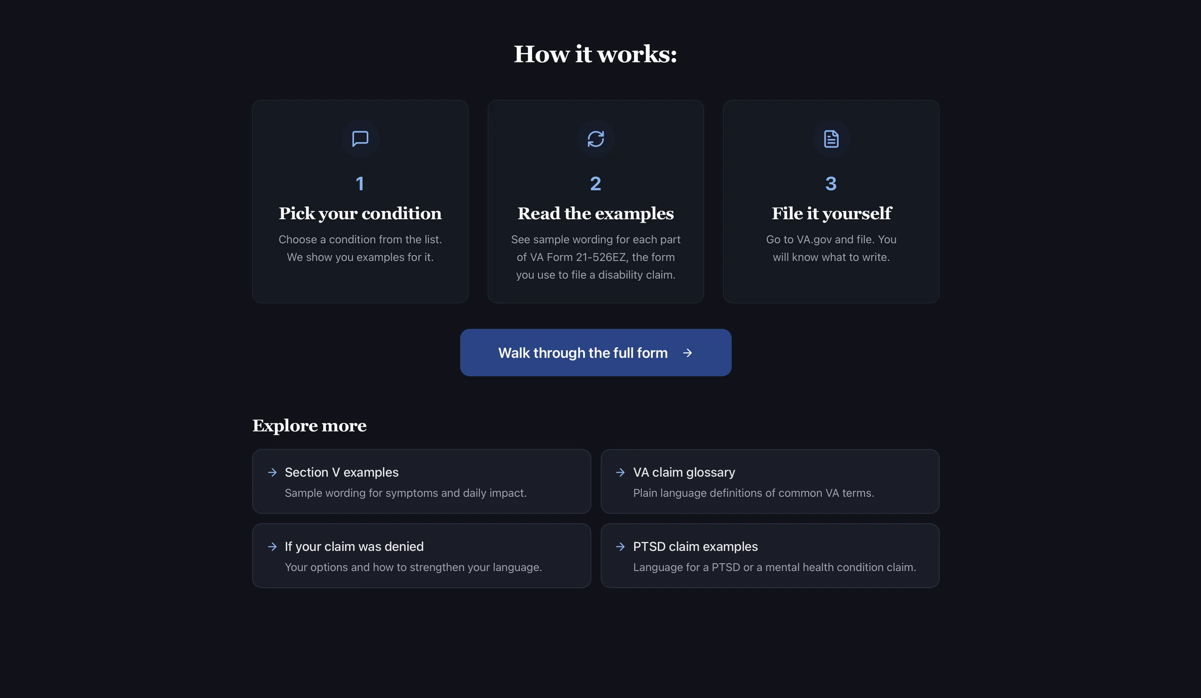
Teach, never file
Rather than creating another filing platform, I designed ServiceConnected to educate and guide. Veterans learn how to prepare their claims while maintaining control of their information and submitting directly through VA.gov.
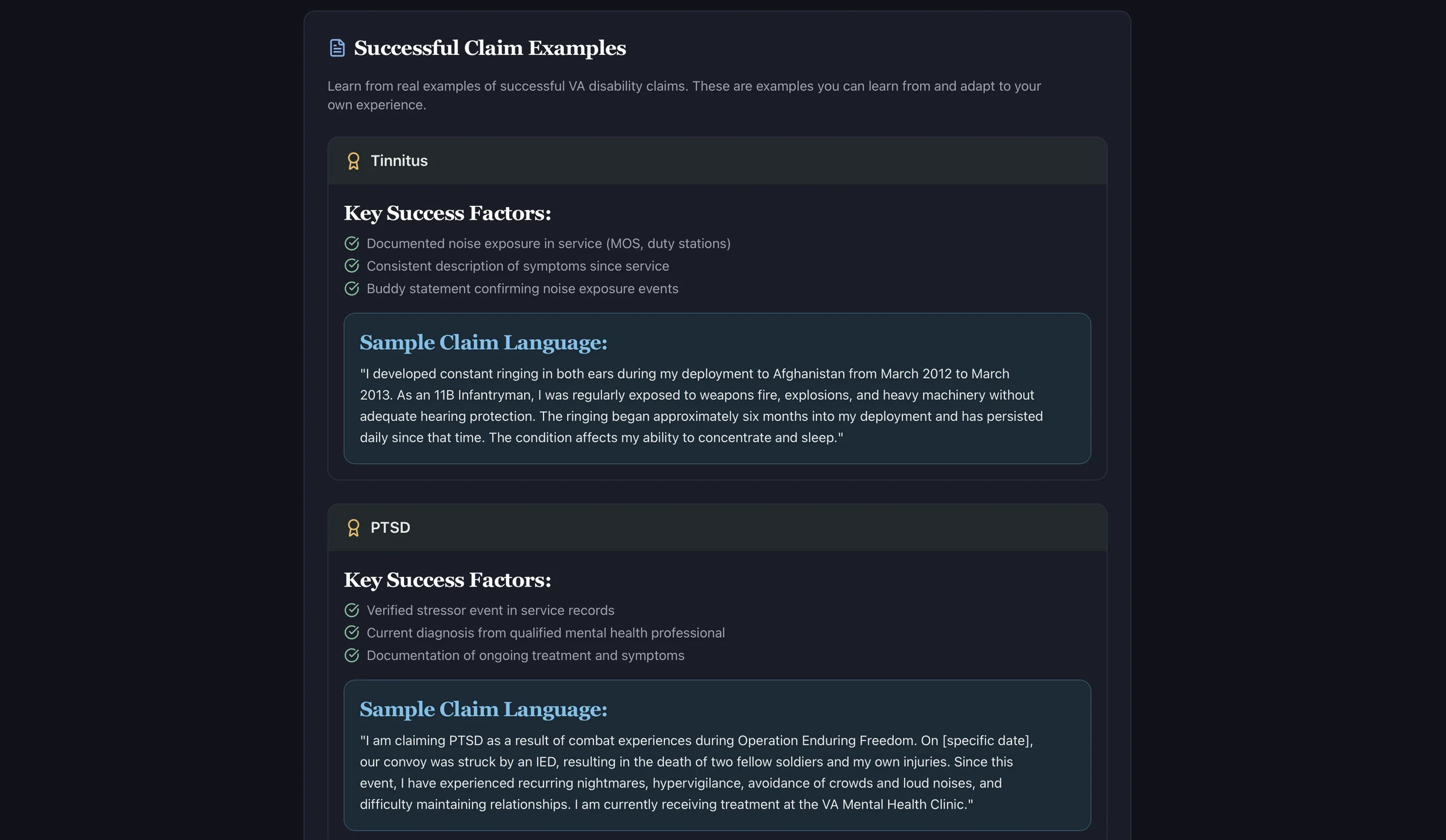
Show real example language
I paired sample statements with key evidence factors to make complex claim requirements easier to understand. Instead of starting with a blank page, veterans have a framework they can adapt to their own experiences.
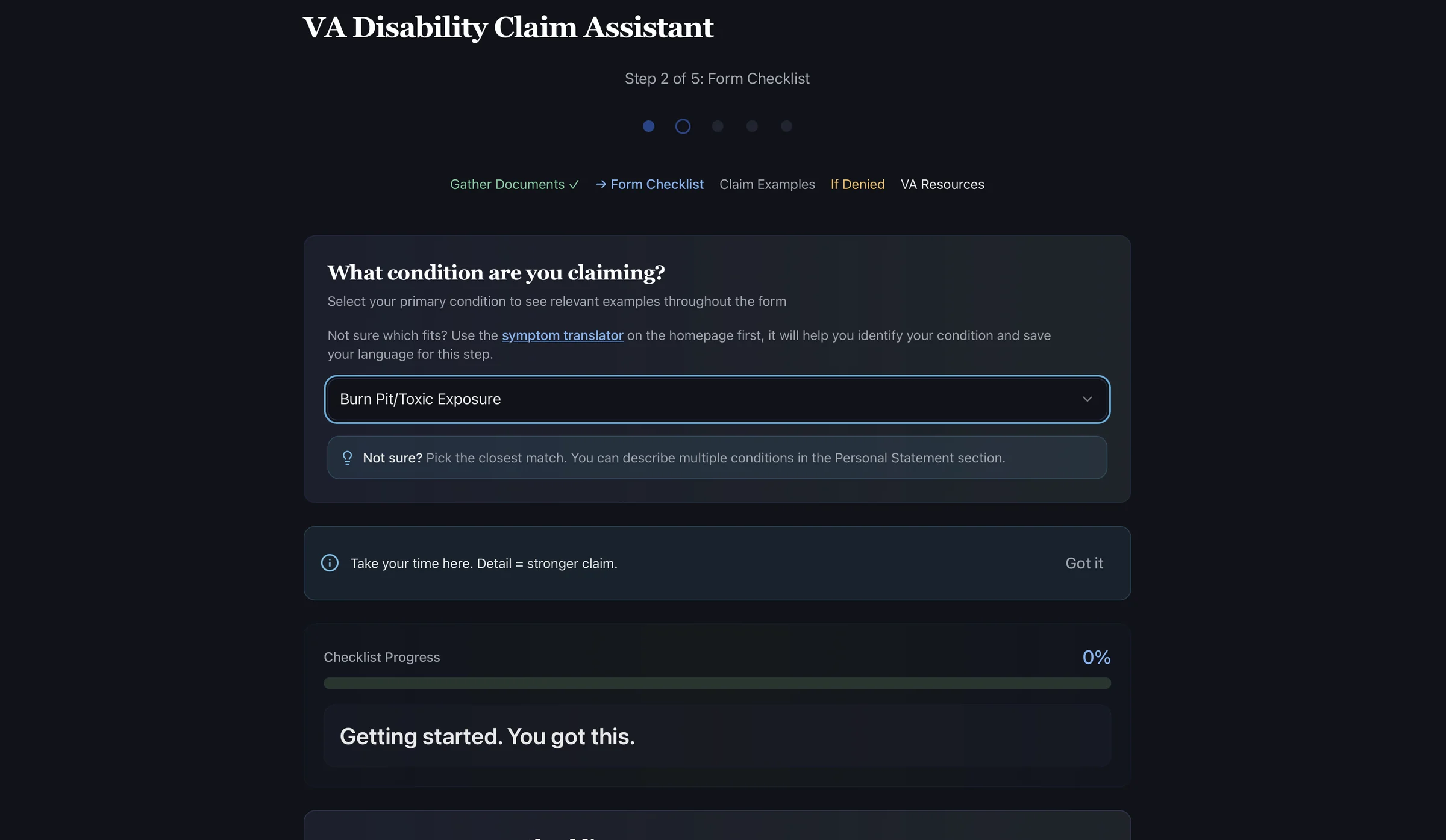
Five steps, one at a time
I broke a complex claims process into five manageable steps, revealing information as veterans need it. Progress indicators provide a sense of direction, helping users focus on one task at a time instead of the entire process.
Make a denial navigable
I organized three VA review and appeal pathways into a side-by-side comparison, making their differences easier to evaluate. A guided helper supports veterans in exploring their options and identifying a potential next step after a denial.
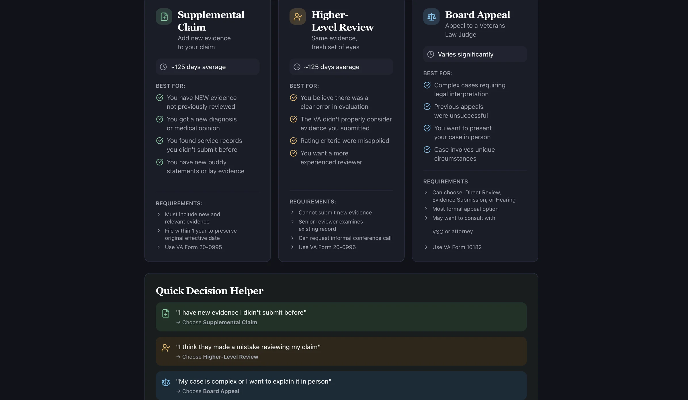
Designed for different reading needs
I introduced adjustable text sizes and light and dark themes to give veterans more control over their reading experience. These settings help users adapt the interface to their preferences rather than forcing everyone into the same presentation.
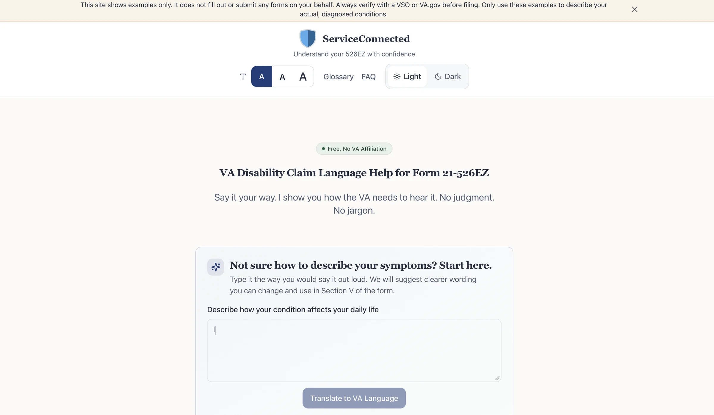
Outcome
The biggest challenge wasn't building the interface. It was translating complex VA terminology into clear, approachable guidance without losing accuracy. This project reinforced how thoughtful content design can be just as important as the technology behind it.
Visit ServiceConnected.vet