Ja'Mesha Robinson
Case Study

Inclusive Design Lab

Learning to design with everyone in mind.

An interactive learning tool I built to explore accessibility principles through hands-on exercises and immediate feedback.

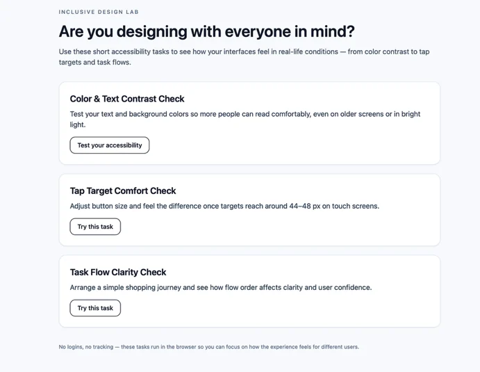
Inclusive Design Lab home screen asking 'Are you designing with everyone in mind?' with three tasks: Color and Text Contrast Check, Tap Target Comfort Check, and Task Flow Clarity Check Visit Live Site
Role
UX/UI Design, Front-End Development
Context
Personal learning project · Inspired by Design Ethics coursework
Built With
React, TypeScript, Tailwind CSS, Vite
Status
Live on Vercel
01 · Introduction

Where it started

Transitioning out of the military and into design opened my eyes to a different way of thinking about the people we serve.

During my Design Ethics course, I began learning more about accessibility: how something as simple as color contrast, button size, or the order of steps in a task can affect someone's experience.

The more I learned, the more I wanted to put those lessons into practice.

Inclusive Design Lab became my way of learning by building, while sharing those lessons with other people who are learning to design.

I didn't build this because I had all the answers. I built it because I wanted to keep asking better questions.

02 · The challenge

Understanding why accessibility matters

When I first started learning about accessibility, guidelines like WCAG introduced concepts I hadn't fully considered in my earlier design work.

Reading about contrast ratios, touch targets, and accessible interactions was one thing. Understanding how those decisions could affect someone's experience was another.

I wanted a way to explore those principles beyond the documentation.

What if learning accessibility meant experiencing the design decisions for yourself?

03 · The approach

Learning through interaction and feedback

I decided to turn a few accessibility concepts I was learning into small, interactive exercises.

Instead of only reading about a guideline, someone could adjust a design, see what changes, and receive feedback explaining why it matters.

I kept each exercise focused on one concept so the experience would feel approachable rather than overwhelming.

The idea was simple: learn something, try it, and understand the impact of the decision.

04 · The exercises

Three interactive exercises

01

Color and text contrast

Experiment with text and background colors to see how contrast affects readability and how different combinations compare with WCAG contrast requirements.

Learning focus: Visual accessibility and readable interfaces.

WCAG contrast: normal text 4.5:1 (AA), 7:1 (AAA). Large text 3:1 (AA), 4.5:1 (AAA).

02

Tap target comfort

Adjust button sizes and explore how the size of an interactive target can affect touch interaction, especially for people with limited dexterity or motor control.

Learning focus: Motor accessibility and comfortable interaction.

WCAG 2.2 target size: 24 by 24 CSS pixels minimum (AA) and 44 by 44 CSS pixels (AAA), each with exceptions.

03

Task flow clarity

Rearrange the steps in a simple shopping journey to explore how the sequence of an interface can make a task easier or harder to follow.

Learning focus: Cognitive accessibility and interaction clarity.

Explores cognitive accessibility principles. It does not test for WCAG compliance.

05 · Design decisions

Why I made those choices

Hands-on experimentation

Let people experience the difference

As I was learning, I found that changing something myself helped me connect a design decision to its effect.

I wanted others to have that same opportunity: to experiment with contrast, target size, and task flow instead of only reading about them.

Contextual guidance

Explain the principle when it matters

I placed feedback alongside each exercise so users could see what changed and understand the accessibility principle behind it.

My goal wasn't to make people memorize guidelines. It was to help them recognize why those guidelines exist.

Keep the experience approachable

Start small, then build understanding

Accessibility covers far more than three exercises. Rather than trying to teach everything at once, I started with a few concepts I could translate into simple interactions.

This gave me a manageable way to practice implementing accessibility concepts while leaving room to expand the lab as I continue learning.

06 · Implementation

How I built it

I built the lab as a lightweight web application, using front-end development to turn accessibility concepts into interactive exercises.

  • React
    Interactive components that update as users change settings.
  • TypeScript
    Typed application logic for exercise states and feedback.
  • Tailwind CSS
    Consistent styling and responsive layouts.
  • Vite
    Development tooling and production builds.

The application is deployed on Vercel.

07 · Outcome and reflection

What I learned by building

I built and published Inclusive Design Lab with three interactive exercises exploring color contrast, touch targets, and task flow.

But the biggest takeaway wasn't the technology.

This project helped me see accessibility as something I need to keep practicing, questioning, and improving, not simply a checklist to complete at the end of a project.

Coming from the military, I was familiar with the importance of serving people and understanding their needs. Studying design ethics gave me another way to think about that responsibility.

Inclusive Design Lab became a small but meaningful way to connect what I was learning with what I could build.

What I'd explore next: I'd like to test the exercises with design learners and people with different accessibility needs, gather feedback on how clearly the concepts are communicated, and continue improving the interactions.

The goal is to keep learning while making the tool more useful to others.

Visit Live Site
Next project Beyond the Screen